library(tidyverse)
library(janitor)3 Data Visualization with ggplot2
In the previous chapter, we learned to import, clean, and transform data. Now it’s time to see it. A well-made figure often reveals patterns that tables alone cannot — outliers, skewed distributions, group differences, and relationships between variables.
For many beginners, ggplot2 feels unusual at first because of its layered syntax. That’s normal. We’ll build up one layer at a time, explaining each new piece before using it.
NoteOur running example: Visualizing a diabetes cohort
Throughout this chapter, we’ll use the diabetes dataset to answer practical questions:
- How are glucose values distributed in this cohort?
- Do distributions differ by diabetes outcome?
- How does BMI relate to glucose?
- How can we present findings clearly for a meeting or publication?
Each plot will answer one question, and each section introduces one new ggplot2 concept.
3.1 Why Visualization Matters in Clinical Work
A table of 768 rows is precise, but a figure is faster to interpret. Good visualizations help us:
- Detect patterns and outliers that numbers alone may hide
- Compare groups at a glance
- Communicate clearly with clinical teams and stakeholders
- Prepare publication- or presentation-ready outputs
In clinical analytics, a clear figure can prevent misunderstandings that a dense table might cause.
3.2 Data Preparation
We load and prepare the diabetes data using tools from Section 2.4 and Section 2.8. This block applies the same steps you learned in Chapter 4:
diabetes_raw <- read_csv("../../data/diabetes.csv", show_col_types = FALSE)

diabetes <- diabetes_raw |>
  clean_names() |>
  mutate(
    diabetes_5y = fct_relevel(diabetes_5y, "neg", "pos"),
    bmi_class = case_when(
      bmi < 18.5 ~ "Underweight",
      bmi < 25   ~ "Normal",
      bmi < 30   ~ "Overweight",
      .default   = "Obesity"
    ) |> factor(levels = c("Underweight", "Normal", "Overweight", "Obesity"))
  )
Everything here — read_csv(), clean_names(), fct_relevel(), case_when(), factor() — was taught in the previous chapter.
3.3 The Grammar of Graphics
ggplot2 is built on a simple idea: every plot is made of layers, and each layer has three components:
| Component | What it does | Example |
|---|---|---|
| Data | The dataset to plot | diabetes |
Aesthetics (aes) |
Map variables to visual properties | x = age, y = glucose_mg_dl, color = diabetes_5y |
Geometry (geom) |
How to draw the data | Points, bars, boxes, lines |
3.3.1 The minimal plot template
Every ggplot2 plot starts with this pattern:
ggplot(data, aes(x = ..., y = ...)) +
  geom_*()
Let’s break it down:
ggplot(data, aes(...))— creates the plot canvas.datais your tibble,aes()maps columns to visual properties.aes(x = ..., y = ...)— the aesthetic mapping. Think of it as “which variable goes where.” Common mappings:x,y,color,fill,size.+ geom_*()— adds a geometry layer that draws the data (histogram bars, scatter points, box plots, etc.)+— the “add a layer” operator. Each+adds something to the plot.
3.3.2 Why + instead of |>?
In data manipulation, we use |> to chain operations. In ggplot2, we use + to add layers. They look similar but mean different things:
|>= “then do this to the data”+= “also draw this on the plot”
WarningDon’t mix
+ and |>
A common beginner mistake is using |> inside ggplot2 code. Remember: |> is for data pipelines, + is for plot layers. If you see an error like “object ‘+’ not found” or “did you accidentally use |> instead of +”, check your operators.
CautionPython Comparison
Python’s matplotlib and seaborn take a different approach — instead of layering with +, you call separate functions:
import matplotlib.pyplot as plt
import seaborn as sns

# seaborn (high-level, similar philosophy to ggplot2)
sns.histplot(data=diabetes, x="glucose_mg_dl", bins=20)
plt.title("Distribution of Glucose")
plt.show()
R’s ggplot2 and Python’s seaborn share the same intellectual ancestor — Leland Wilkinson’s Grammar of Graphics.
3.4 Your First Plot: Histogram
A histogram shows the distribution of a single continuous variable. Let’s start with the simplest possible version and build up.
3.4.1 A basic histogram
ggplot(diabetes, aes(x = glucose_mg_dl)) +
  geom_histogram()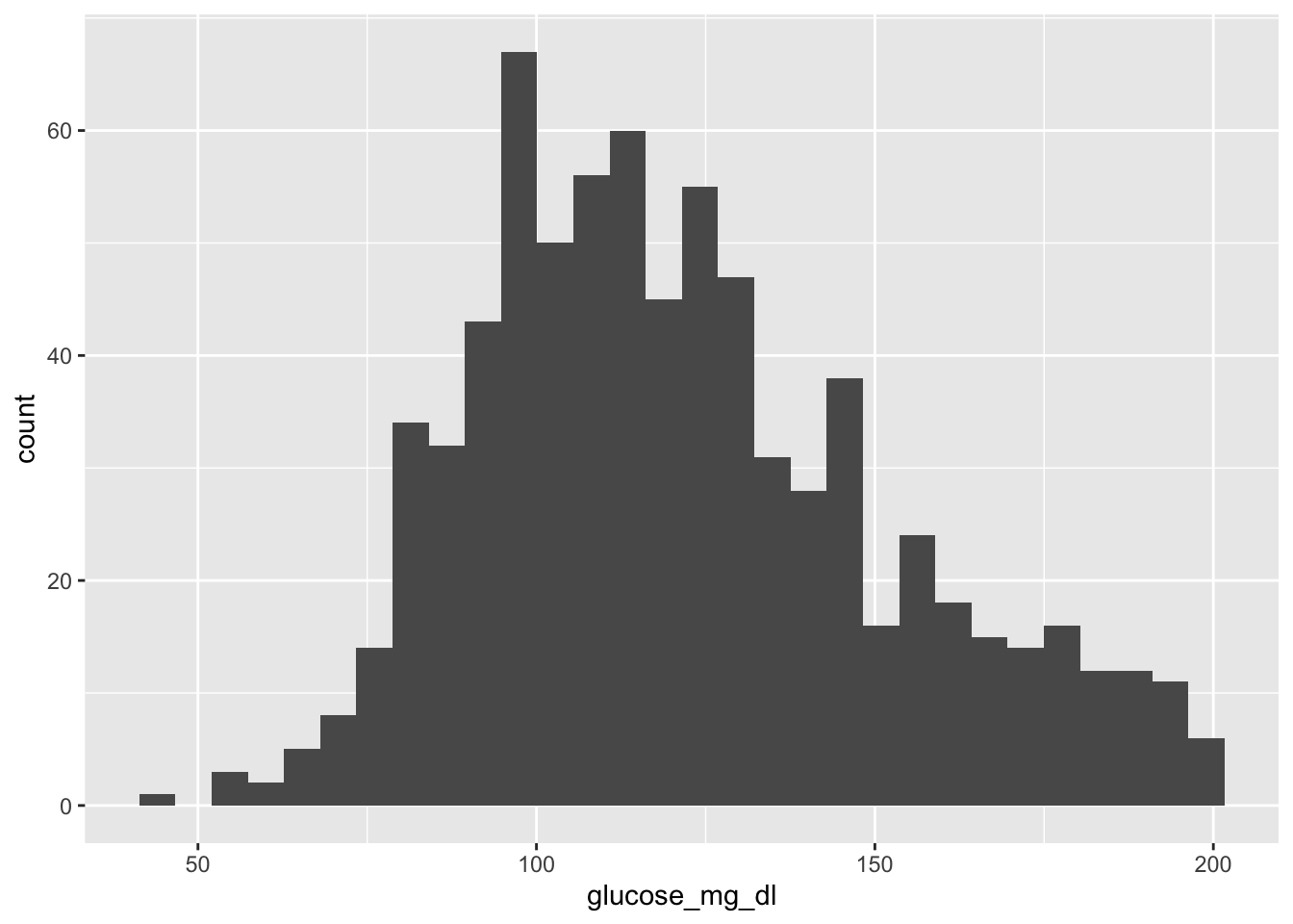
That’s it — three lines. R picked a default bin width and drew the bars. But we can do much better.
3.4.2 Adjusting bin width
The default bin count (30) may not suit your data. Use binwidth to control the width of each bar:
ggplot(diabetes, aes(x = glucose_mg_dl)) +
  geom_histogram(binwidth = 10)
Each bar now spans 10 mg/dL. Experiment with different values — smaller bins show more detail, larger bins show the overall shape.
3.4.3 Adding color and labels
Note
fill vs color in ggplot2
These two aesthetics are easy to confuse:
fill= the interior color of shapes (bars, boxes, areas)color= the outline (border) of shapes, or the color of points and lines
For a histogram, fill colors the bars and color draws their borders.
ggplot(diabetes, aes(x = glucose_mg_dl)) +
  geom_histogram(binwidth = 10, fill = "steelblue", color = "white") +
  labs(
    title = "Distribution of Plasma Glucose",
    x = "Glucose (mg/dL)",
    y = "Number of patients"
  ) +
  theme_minimal()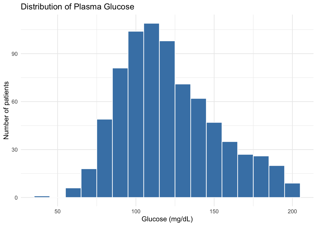
We added three new elements:
fill = "steelblue"— bar interior color (set outsideaes()because it’s a fixed value, not mapped to a variable)labs(...)— title and axis labelstheme_minimal()— a clean, uncluttered theme
3.4.4 Adding a clinical reference line
Clinical thresholds are often worth marking on a plot. geom_vline() draws a vertical line:
ggplot(diabetes, aes(x = glucose_mg_dl)) +
  geom_histogram(binwidth = 10, fill = "steelblue", color = "white") +
  geom_vline(xintercept = 140, linetype = "dashed", color = "firebrick") +
  labs(
    title = "Distribution of Plasma Glucose",
    subtitle = "Dashed line at 140 mg/dL (diabetes screening threshold)",
    x = "Glucose (mg/dL)",
    y = "Number of patients"
  ) +
  theme_minimal()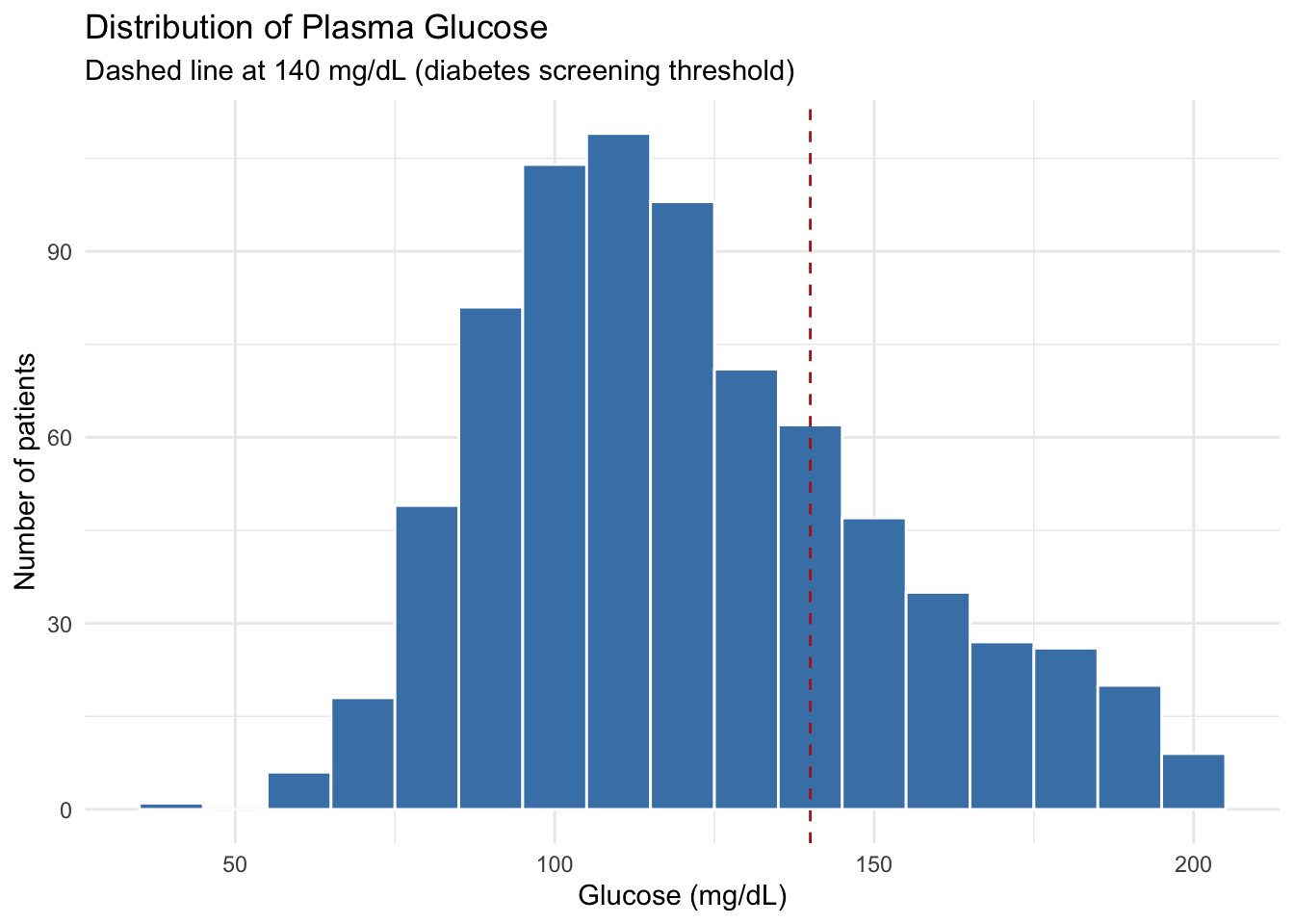
TipReference lines for clinical thresholds
geom_vline(xintercept = ...) for vertical lines and geom_hline(yintercept = ...) for horizontal lines are great for marking clinical cutoffs — fasting glucose thresholds, BMI boundaries, blood pressure targets, etc.
3.4.5 Interpretation
The glucose distribution is right-skewed: most patients cluster between 80–140 mg/dL, with a long tail extending toward higher values. The dashed line at 140 mg/dL shows where the clinical threshold falls.
3.5 Comparing Groups: Boxplot
When comparing a continuous variable across groups, boxplots are often the best starting point. They show the median, quartiles, and spread in one compact display.
3.5.1 A basic boxplot
ggplot(diabetes, aes(x = diabetes_5y, y = glucose_mg_dl)) +
  geom_boxplot()
Already useful — we can see the pos group has a higher median glucose.
3.5.2 Adding color by group
Map fill to the grouping variable inside aes() to color each group:
ggplot(diabetes, aes(x = diabetes_5y, y = glucose_mg_dl, fill = diabetes_5y)) +
  geom_boxplot() +
  labs(
    title = "Glucose by 5-Year Diabetes Outcome",
    x = "Outcome at 5 years",
    y = "Glucose (mg/dL)",
    fill = "Outcome"
  ) +
  theme_minimal()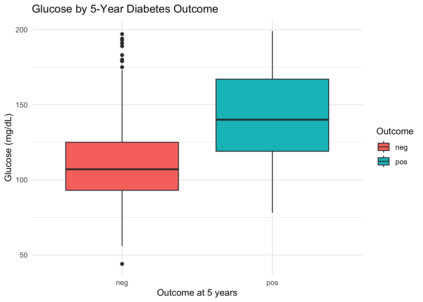
Note
fill inside vs outside aes()
- Inside
aes(fill = diabetes_5y)— color is mapped to a variable. Each group gets its own color automatically. - Outside
aes(), e.g.,fill = "steelblue"— a fixed color applied to everything.
This inside/outside distinction applies to all aesthetics: fill, color, size, alpha, etc.
3.5.3 Overlaying individual points with geom_jitter()
Boxplots summarize, but they hide individual data points. Adding geom_jitter() shows every patient:
ggplot(diabetes, aes(x = diabetes_5y, y = glucose_mg_dl, fill = diabetes_5y)) +
  geom_boxplot(outlier.shape = NA) +
  geom_jitter(width = 0.15, alpha = 0.25, size = 1) +
  labs(
    title = "Glucose by 5-Year Diabetes Outcome",
    x = "Outcome at 5 years",
    y = "Glucose (mg/dL)",
    fill = "Outcome"
  ) +
  theme_minimal()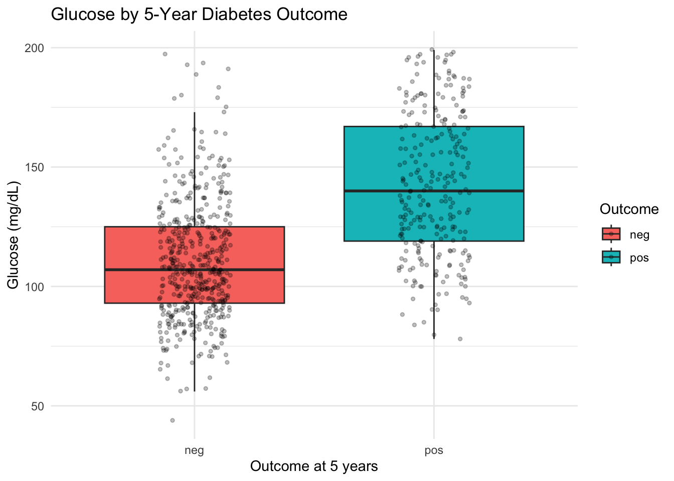
geom_jitter(width = 0.15)— adds points with slight horizontal randomness to reduce overlapalpha = 0.25— makes points semi-transparent so dense areas are visibleoutlier.shape = NA— hides the boxplot’s built-in outlier dots (since jitter already shows all points)
3.5.4 Handling missing values with drop_na()
Real data has missing values. When ggplot2 encounters NAs, it usually drops them with a warning message. You can handle this explicitly with drop_na():
# Drop rows where insulin is missing before plotting
diabetes |>
  drop_na(insulin_microiu_ml) |>
  ggplot(aes(x = diabetes_5y, y = insulin_microiu_ml)) +
  geom_boxplot()
drop_na(column1, column2) removes rows where any of the specified columns are NA. If you call drop_na() without arguments, it removes rows with NA in any column.
Warning
drop_na() removes entire rows
When you drop rows with missing values, you’re removing those patients from the analysis entirely. This is fine for plotting, but be mindful of how much data you’re losing — especially if missingness is substantial (e.g., insulin has ~49% missing in this dataset).
3.5.5 Interpretation
The pos group clearly shows higher glucose values than the neg group, with the median shifted upward. The jitter points reveal that both groups have a wide spread, with considerable overlap.
3.6 Exploring Relationships: Scatter Plot
When you want to see how two continuous variables relate, a scatter plot is the tool.
3.6.1 A basic scatter plot
ggplot(diabetes, aes(x = bmi, y = glucose_mg_dl)) +
  geom_point()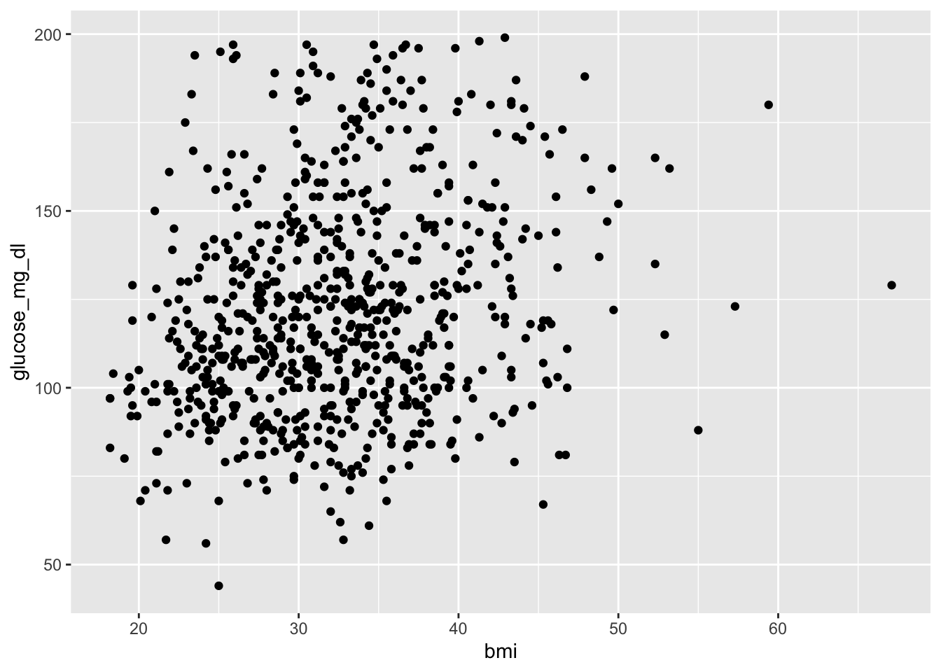
Each dot is one patient. We can already see a general upward trend.
3.6.2 Adding color for a third variable
Add color = diabetes_5y inside aes() to show a third variable:
ggplot(diabetes, aes(x = bmi, y = glucose_mg_dl, color = diabetes_5y)) +
  geom_point(alpha = 0.6) +
  labs(
    title = "BMI vs Glucose",
    x = "Body mass index (kg/m²)",
    y = "Glucose (mg/dL)",
    color = "Outcome"
  ) +
  theme_minimal()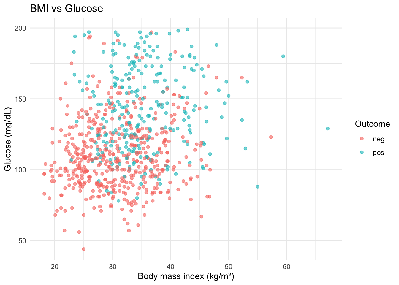
Note
fill vs color — when to use which
- Use
colorfor points and lines (things without an interior) - Use
fillfor bars, boxes, and areas (things with an interior)
Some geoms use both: geom_boxplot() uses fill for the box interior and color for the border.
3.6.3 Adding a trend line
geom_smooth() adds a fitted trend line. By default, it uses a flexible smoother. Add method = "lm" for a straight line:
ggplot(diabetes, aes(x = bmi, y = glucose_mg_dl, color = diabetes_5y)) +
  geom_point(alpha = 0.5) +
  geom_smooth(method = "lm") +
  labs(
    title = "BMI vs Glucose with Trend Lines",
    x = "Body mass index (kg/m²)",
    y = "Glucose (mg/dL)",
    color = "Outcome"
  ) +
  theme_minimal()
NoteWhat does
method = "lm" mean?
"lm" stands for linear model — it draws a straight-line best fit. The shaded band around the line is a confidence interval, showing the uncertainty in the trend. We’ll learn about linear models formally in a later chapter; for now, just think of it as “draw the best straight line through these points.”
If you omit method = "lm", ggplot2 uses a flexible curve (called LOESS) that follows the data more closely.
3.6.4 Interpretation
Both groups show a slight positive trend: higher BMI tends to associate with higher glucose. The pos group’s line sits higher overall. Remember, this is descriptive — we’re not claiming BMI causes higher glucose.
CautionPython Comparison
Python’s seaborn provides similar scatter + trend line functionality:
import seaborn as sns

sns.lmplot(
    data=diabetes,
    x="bmi", y="glucose_mg_dl",
    hue="diabetes_5y",
    height=5,
    scatter_kws={"alpha": 0.5}
)
lmplot() combines scatter points and linear regression lines, similar to geom_point() + geom_smooth(method = "lm").
3.7 Categorical Comparisons: Bar Chart
For comparing counts across categories, bar charts are the standard.
3.7.1 Preparing counts with count()
First, compute the counts (using count() from Section 2.9):
bmi_counts <- diabetes |>
  count(diabetes_5y, bmi_class)
bmi_counts
# A tibble: 7 × 3
diabetes_5y bmi_class n
<fct> <fct> <int>
1 neg Underweight 4
2 neg Normal 95
3 neg Overweight 139
4 neg Obesity 262
5 pos Normal 7
6 pos Overweight 40
7 pos Obesity 2213.7.2 geom_col() for pre-computed values
Since we already have the n column, we use geom_col() (not geom_bar()):
ggplot(bmi_counts, aes(x = bmi_class, y = n, fill = diabetes_5y)) +
  geom_col(position = "dodge") +
  labs(
    title = "BMI Class by Diabetes Outcome",
    x = "BMI class",
    y = "Number of patients",
    fill = "Outcome"
  ) +
  theme_minimal()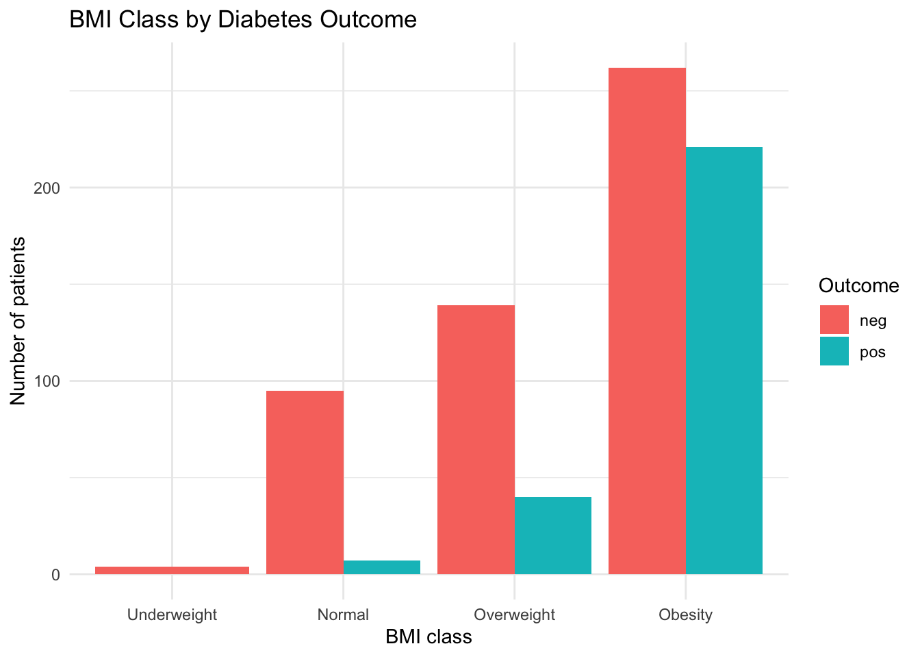
Note
geom_col() vs geom_bar()
geom_col()— you provide bothxandy. The bar heights come from your data (pre-computed counts).geom_bar()— you provide onlyx. ggplot2 counts the rows for you automatically.
When you’ve already computed counts with count() or summarise(), use geom_col().
3.7.3 Side-by-side bars with position = "dodge"
The position argument controls how grouped bars are arranged:
TipThree bar position options
| Position | Effect | Best for |
|---|---|---|
"dodge" |
Side-by-side | Comparing absolute counts |
"stack" (default) |
Stacked on top | Showing totals with group composition |
"fill" |
Stacked to 100% | Comparing proportions |
# Proportional view — each bar reaches 100%
ggplot(bmi_counts, aes(x = bmi_class, y = n, fill = diabetes_5y)) +
  geom_col(position = "fill") +
  labs(
    title = "Proportion of Diabetes Outcome by BMI Class",
    x = "BMI class",
    y = "Proportion",
    fill = "Outcome"
  ) +
  theme_minimal()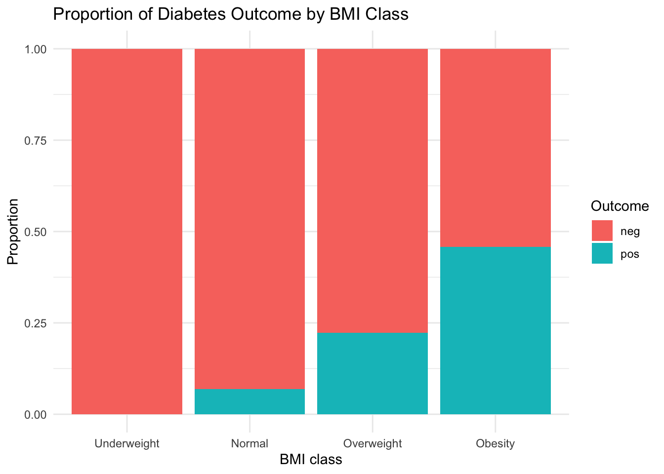
3.7.4 Interpretation
The Obesity category dominates both groups, but the proportion of pos outcomes increases with higher BMI class.
CautionPython Comparison
Python’s seaborn provides countplot() for similar bar charts:
import seaborn as sns

sns.countplot(data=diabetes, x="bmi_class", hue="diabetes_5y")
For pre-computed values, use sns.barplot() or matplotlib’s bar().
3.8 Splitting into Panels: Faceting
Sometimes overlaying groups on one plot gets crowded. Faceting splits the plot into separate panels — one per group.
3.8.1 facet_wrap() — one variable
ggplot(diabetes, aes(x = glucose_mg_dl)) +
  geom_histogram(binwidth = 10, fill = "steelblue", color = "white") +
  facet_wrap(~ diabetes_5y) +
  labs(
    title = "Glucose Distribution by Diabetes Outcome",
    x = "Glucose (mg/dL)",
    y = "Number of patients"
  ) +
  theme_minimal()
The syntax facet_wrap(~ variable) means “create one panel per level of this variable.” The ~ (tilde) is R’s formula notation — here it simply means “split by.”
TipWhen to facet vs when to color
- Facet when groups have very different distributions or when overlap makes the plot hard to read
- Color when groups overlap but you want them on the same axes for direct comparison
Both are valid — choose whichever communicates more clearly.
3.9 Customizing Your Plots
3.9.1 Labels with labs()
labs() sets all text elements at once:
labs(
  title    = "Main title",
  subtitle = "Additional context",
  x        = "X-axis label",
  y        = "Y-axis label",
  fill     = "Legend title (for fill)",
  color    = "Legend title (for color)",
  caption  = "Source or note"
)
Always include units in axis labels (e.g., “Glucose (mg/dL)” not just “Glucose”).
3.9.2 Themes: built-in options
ggplot2 includes several themes that change the overall look:
| Theme | Style |
|---|---|
theme_minimal() |
Clean, no box frame |
theme_bw() |
White background with border |
theme_classic() |
Publication-style with axes only |
theme_light() |
Light gray background, fine grid |
theme_void() |
Nothing but the data (useful for maps) |
TipChoosing a theme
- For presentations:
theme_minimal()(clean, modern) - For publications:
theme_classic()ortheme_bw()(formal, traditional) - For dashboards:
theme_light()(readable on screens)
Pick one and use it consistently throughout a report.
3.9.3 Manual colors
Control colors explicitly with scale_fill_manual() or scale_color_manual():
# For fill aesthetic (bars, boxes)
scale_fill_manual(values = c("neg" = "forestgreen", "pos" = "firebrick"))

# For color aesthetic (points, lines)
scale_color_manual(values = c("neg" = "forestgreen", "pos" = "firebrick"))
Note
scale_fill_manual() vs scale_color_manual()
Use scale_fill_manual() when your aesthetic is fill (bars, boxes). Use scale_color_manual() when your aesthetic is color (points, lines). They work identically, just for different aesthetics.
3.9.4 Journal-style palettes with ggsci (optional)
The ggsci package provides color palettes inspired by scientific journals:
library(ggsci)

ggplot(diabetes, aes(x = bmi, y = glucose_mg_dl, color = diabetes_5y)) +
  geom_point(alpha = 0.5) +
  geom_smooth(method = "lm") +
  scale_color_lancet() +
  labs(
    title = "BMI vs Glucose (Lancet palette)",
    x = "Body mass index (kg/m²)",
    y = "Glucose (mg/dL)",
    color = "Outcome"
  ) +
  theme_minimal()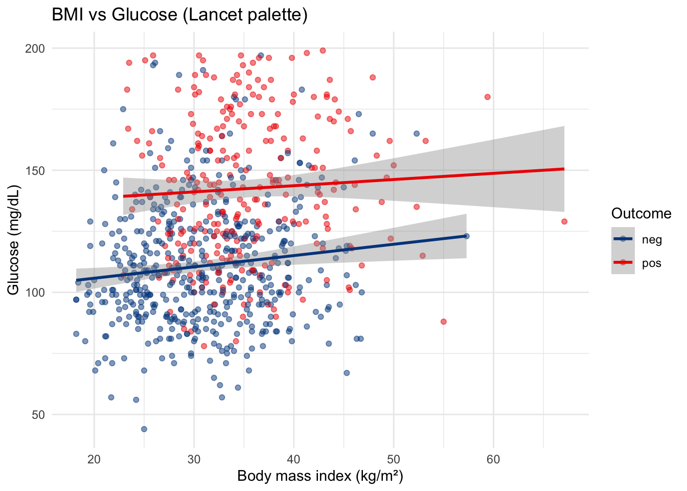
scale_color_lancet() applies colors inspired by The Lancet journal. Other options include scale_color_nejm() (NEJM), scale_color_npg() (Nature), and scale_color_jama() (JAMA).
TipWhen to use
ggsci
ggsci palettes are designed for a small number of groups (2–8). They’re a quick way to get publication-quality colors without choosing hex codes manually.
3.10 Putting It All Together
Let’s combine data transformation and visualization in one pipeline — the real-world pattern:
diabetes |>
  filter(bmi > 0) |>
  mutate(bmi_group = if_else(bmi >= 30, "Obese", "Non-obese")) |>
  ggplot(aes(x = glucose_mg_dl, fill = bmi_group)) +
  geom_histogram(binwidth = 10, color = "white", alpha = 0.7, position = "identity") +
  labs(
    title = "Glucose Distribution by Obesity Status",
    x = "Glucose (mg/dL)",
    y = "Number of patients",
    fill = "BMI group"
  ) +
  theme_minimal()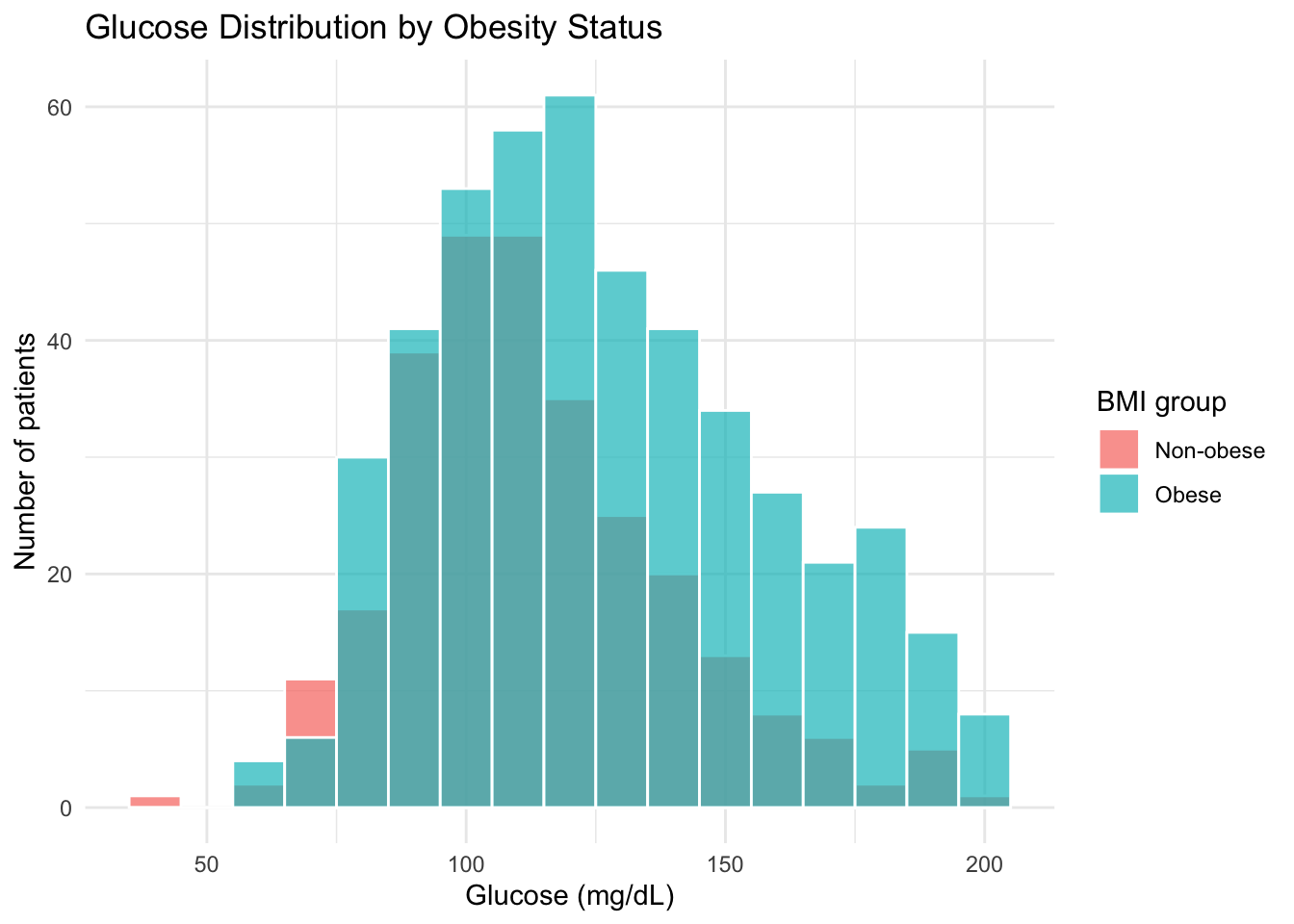
Notice the seamless transition from |> (data manipulation) to + (ggplot2 layers). The data flows through filter() and mutate(), then into ggplot().
TipThe transform-then-plot pattern
In practice, you’ll often pipe data through a few dplyr verbs before handing it to ggplot(). This keeps your plotting code focused on visualization while the dplyr steps handle data preparation.
3.11 Common Errors and Troubleshooting
| Error or Symptom | Cause | Fix |
|---|---|---|
| Empty plot (gray box, no data) | Forgot geom_*() layer |
Add + geom_histogram() or similar |
object 'colname' not found |
Column name typo in aes() |
Check names(data) |
stat_bin() requires a continuous x |
Used a factor/character on x of histogram | Check class(column), convert if needed |
\|> used instead of + |
Mixed pipe and ggplot operators | Use + between ggplot layers |
| Legend shows unexpected groups | NA values in grouping variable | Use drop_na() before plotting |
| Bars overlap instead of side-by-side | Missing position = "dodge" |
Add position = "dodge" to geom_col() |
3.12 Summary
Here’s the visualization journey we took with the diabetes data:
| Step | What we visualized | ggplot2 tool |
|---|---|---|
| Distribution | Glucose histogram | geom_histogram() |
| Reference | Clinical threshold line | geom_vline() |
| Group comparison | Glucose by outcome (boxplot) | geom_boxplot(), geom_jitter() |
| Relationship | BMI vs glucose (scatter) | geom_point(), geom_smooth() |
| Categories | BMI class by outcome (bars) | geom_col(), position |
| Panels | Glucose faceted by outcome | facet_wrap() |
| Style | Labels, themes, palettes | labs(), theme_*(), ggsci |
In the next chapter, we’ll move from visual summaries to formal descriptive statistics — computing and presenting the numbers behind what we’ve been seeing in these plots.
Exercises
Histogram with threshold. Create a histogram of
dbp_mm_hg(diastolic blood pressure) with bin width 5. Add a vertical dashed line at 80 mmHg (the threshold for elevated blood pressure). Include a title and axis labels.Group comparison. Create a boxplot of
bmibydiabetes_5y, with jitter points overlaid. Write 2–3 sentences interpreting what you observe about the two groups.Scatter with trend. Plot
age(x-axis) vsglucose_mg_dl(y-axis), colored bydiabetes_5y. Add linear trend lines. Does the relationship between age and glucose appear different for the two outcome groups?Faceted bar chart. Compute counts of
bmi_classbydiabetes_5y, then create a dodged bar chart. Now recreate it usingposition = "fill"to show proportions. Which version better highlights the relationship between BMI class and diabetes outcome?